Laser cut audio pt. II
A design pulled from an existing photograph An example of a curved spiral design with a center icon etched separately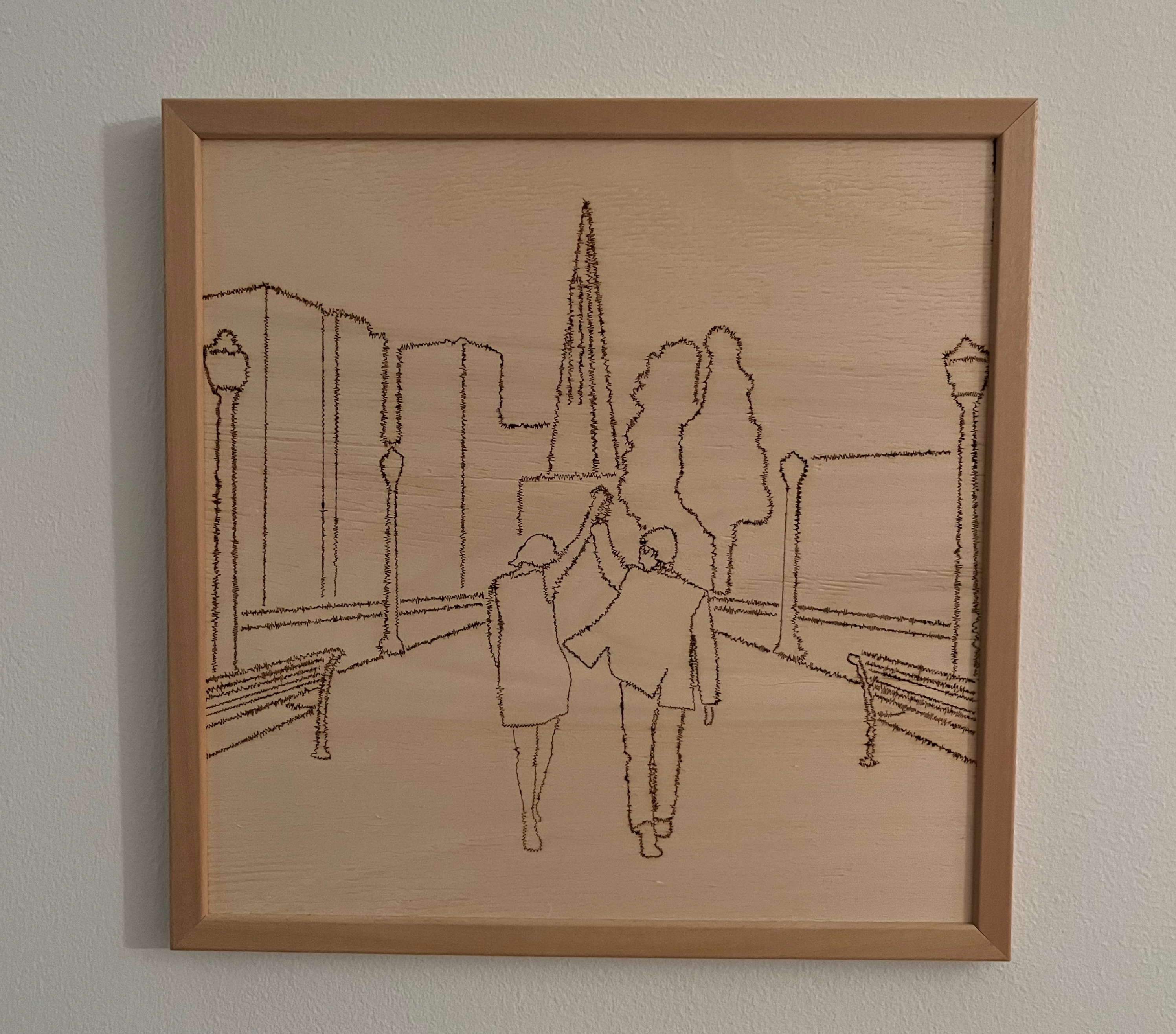
![]()
Overview
By the end of the previous writeup for this project, I could generate different shapes and simple designs using the traced audio data exported from audio files. The code was limited in its ability to move through a 2D space, however, and each data point was restricted to only a single axis of motion each step.
Going forward, I knew I wanted much more flexibility in what could be drawn with the audio “line”. Unfortunately, that introduces a lot more complexity in how the audio data is translated from its one-dimensional coordinate system to the created image.
Since I’m very much not an artist in the traditional sense of the word, I pulled in a Processing library to plot existing SVG files rather than try to generate images from scratch. This library could take an SVG file as input and transform that into a series of points along the curves within the image. I then used these points as the base line to trace, transforming it with the audio data along the way.
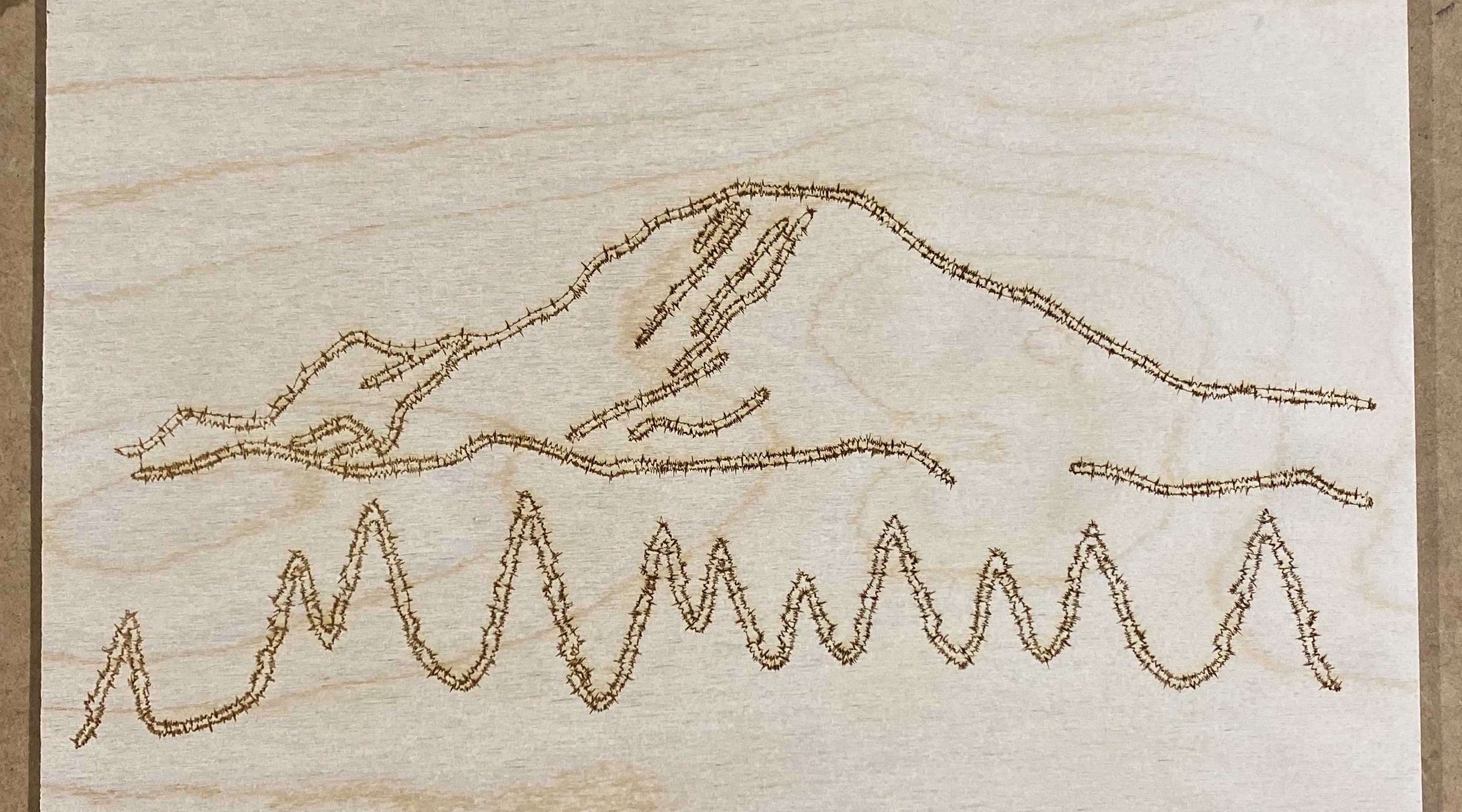
Another complex-curve example of mountains pulled from an .svg
Accurately rendering the audio waveform off-axis
The way a simple line design like the square spiral is translated from an actual line to displaying the audio waveform is relatively simple. Each subsequent point on the line travels a set “step” distance in one direction. If the line is moving horizontally left to right, then each point plotted and then connected will step over N pixels horizontally and zero vertically. By altering the unchanged dimension (in this case the Y coordinate) with each subsequent value in the audio data array, that horizontal line will meander up and down with the amplitude of the audio signal.
When the points plotting the line turn to travel vertically down, the audio data switches to altering the X coordinate of the plotted point. Each axis of a single plotted point acts independently of the other, making the code relatively simple.
The complicated factor of lines that travel not on a single axis at one time is that the “step” value and the audio data must then both affect the X and the Y aspects of the coordinate. If points are plotted along a straight line that is traveling at a forty-five-degree angle, the X and Y distance of the next point must be calculated so that the straight line connecting it to the previous point is the full “step” length. That means the X and Y values are less than the “step” length by some amount.
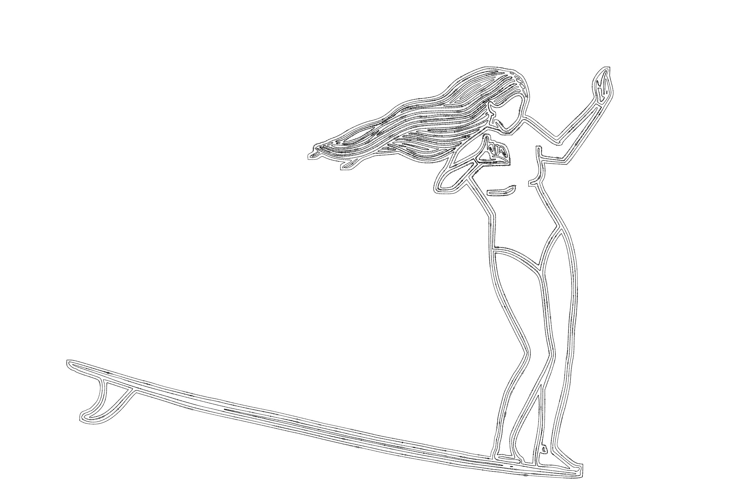
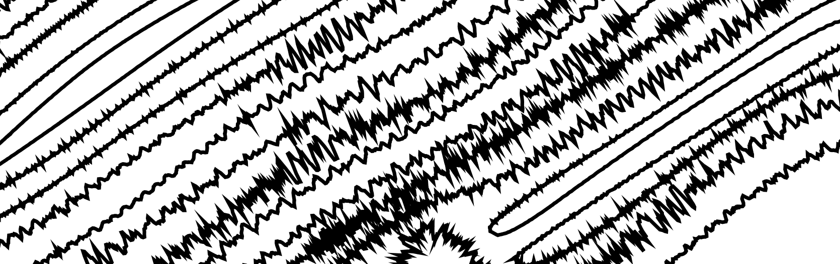
A drawing with plenty of curves and direction changes
The audio waveform’s perspective of what’s ‘up’ and ‘down’ changes as the underlying path curves
No matter what direction the line was traveling in, I still wanted to display the audio wave as it would normally look if that angled line were rotated to horizontal. So if a circle was plotted, the audio line would look natural no matter which angle the circle was rotated to. Otherwise, if the audio data only ever affected the Y coordinate of the plotted points like in the horizontal line model, the waveform would be weirdly distorted at any other angle than flat horizontal.
To properly calculate the X and Y coordinates of a single point transformed by the “step” distance in the direction of line travel and also the audio data perpendicular to the direction of line travel, I had to pull out some very rusty inverse trigonometry from middle school.
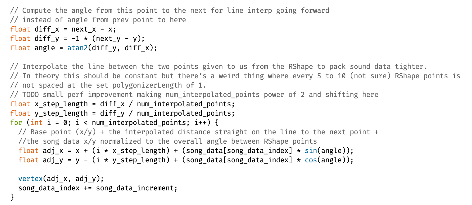
The section of the code responsible for transforming the next plotted point based on the trigonometric angle and point-to-point interpolation
The first step was to calculate the current angle of the line. Subtracting the current X and Y from the X and Y of the next point on the line being followed, then taking the arctan of the Y difference over the X difference, gives the correct angle. Using this angle, sine and cosine can be used to calculate how large the X and Y components of the line angle are. Multiplying those ratio values by the audio data amplitude yielded the proper adjustment of angle in the waveform in actual X and Y coordinates. These coordinates were appended to the initial X and Y coordinates from the underlying line and then plotted.
Basic linear interpolation between SVG points
I mentioned in the overview that I was using a Processing library to take in an SVG file and produce an array of points. In theory, that worked just fine. In practice, the resolution of the points generated was far too rough.
What I mean by resolution is the spacing between each point on a curve of the SVG file. Even for relatively complicated images, the number of data points parsed out of the audio data dwarfed the number of coordinates parsed from the SVG.
To solve this problem, I implemented the most basic linear interpolation possible. Instead of moving from SVG point to SVG point and adjusting them with the audio data and trig functions, I treated the distance between each SVG point as its own line that I then shoved multiple more audio coordinates onto. This meant that instead of two SVG coordinates resulting in two audio data points plotted, I could fit an arbitrary amount of audio data between each point.
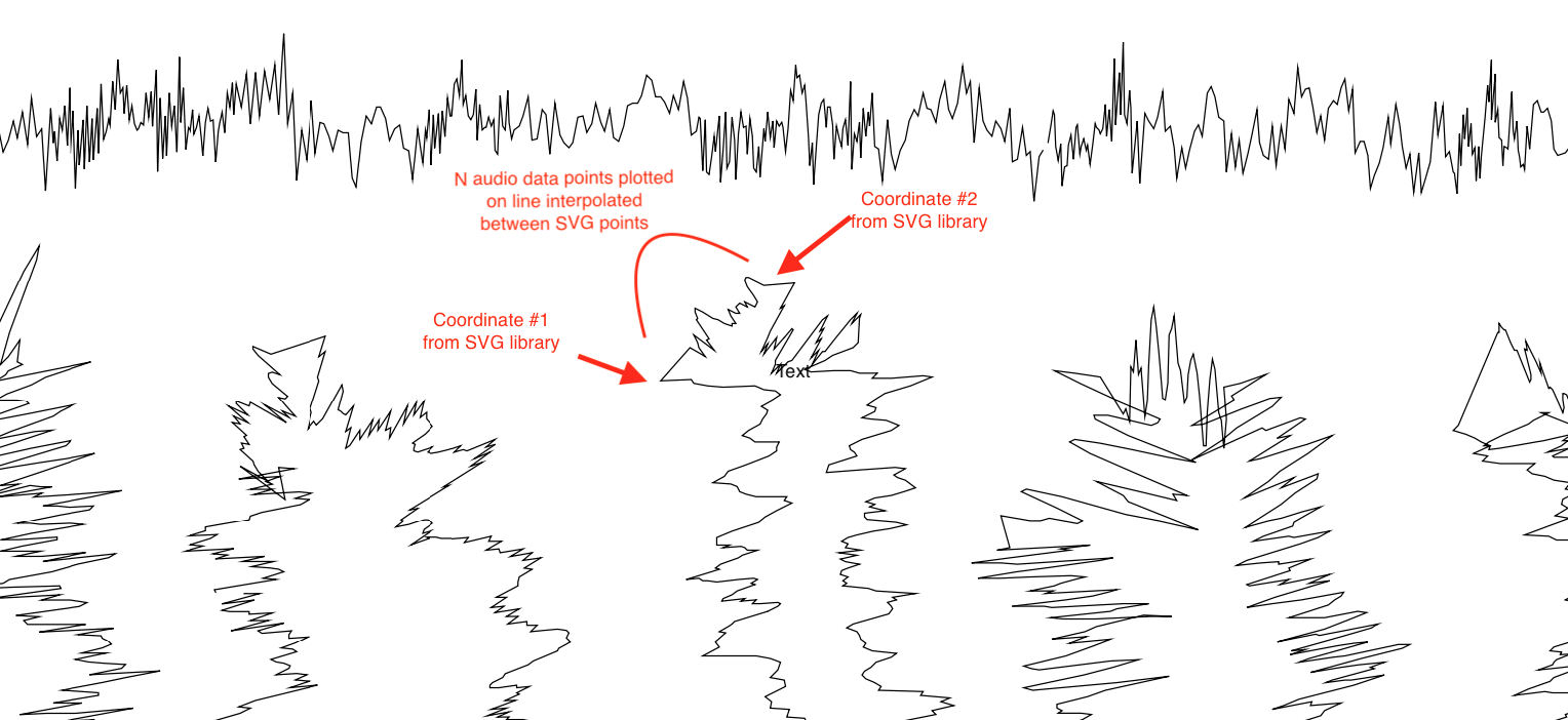
This required a balance since too many audio data points between a pair of SVG coordinates would cause the audio waveform to be far too bunched up and spiky to be clear and visible once laser cut. To make things annoyingly more complicated, the distance between the SVG points wasn’t always constant even within a single image.
I ended up settling roughly on 10-15 audio data points between each pair of SVG coordinates. For most SVG images that seemed to produce a relatively visible waveform without an overwhelmingly large difference between the number of SVG points and audio data entries.
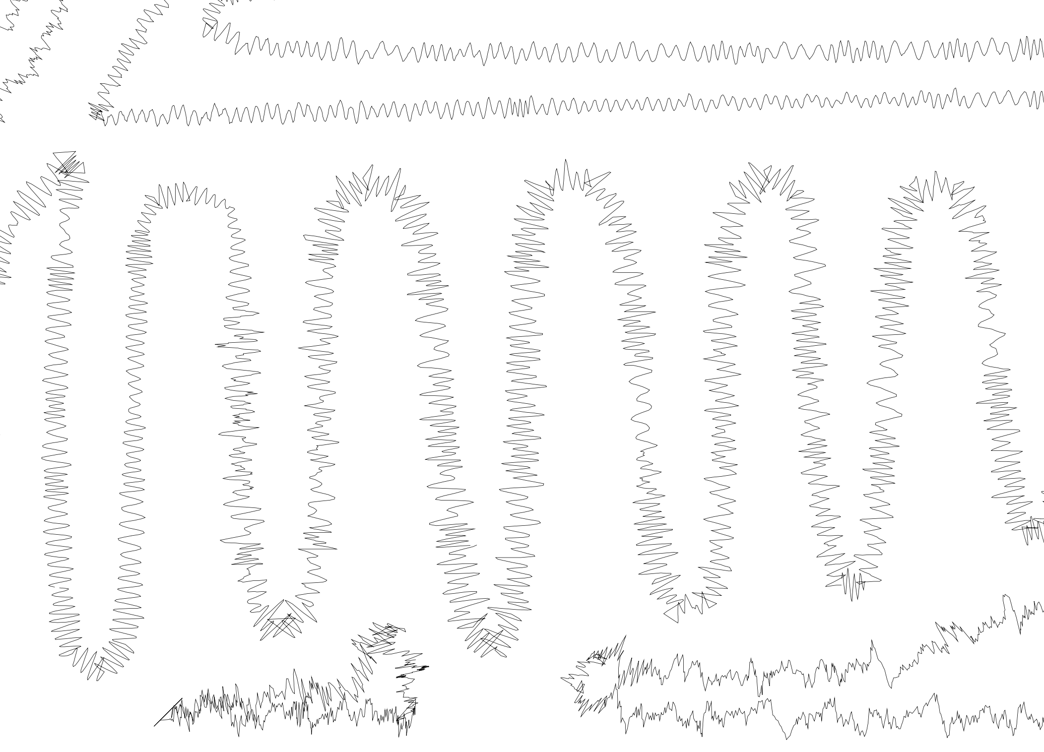
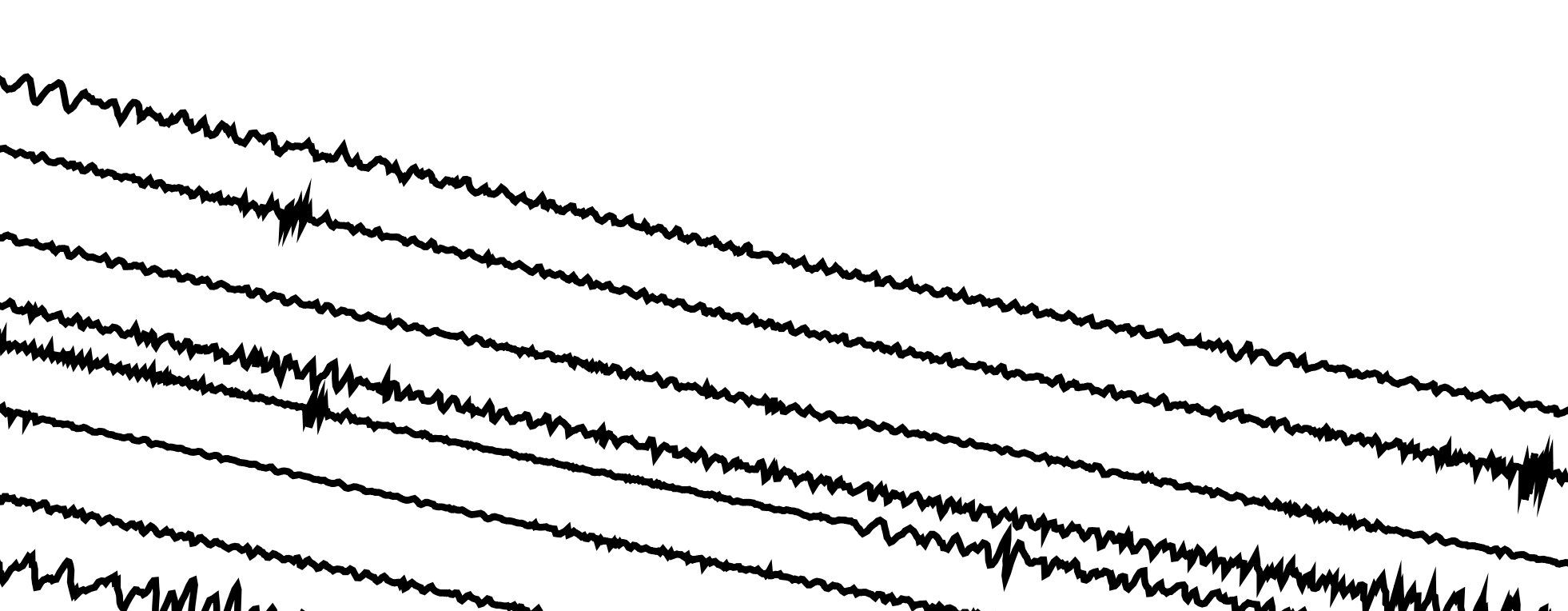
Large jumps in SVG points
Another quirk of the SVG library was that when generating its array of coordinates, it would occasionally jump to the other side of the image. For the most part, the coordinates in the array followed the basic lines of the image in order. Every so often, however, the next coordinate in the list would be clear across the image. This would result in long ugly lines crisscrossing the underlying image as the line-following continuously plotted lines between each subsequent coordinate in the SVG data array.
This was a relatively simple fix, thankfully. Instead of blindly applying the audio data transform to each SVG point then plotting it, I implemented a check for the overall distance between the point-to-be-plotted and the previous drawn coordinate. By checking the distance between the two points (another formula from 5th grade) against a constant value representing the maximum realistic distance between two contiguous points, I could alter the drawing behavior to “pick up the pen” for any jump deemed to be not a part of the original image line.
This throws off the angle calculations for the surrounding points, but it’s a brief enough shift that it blends into the overall image waveforms just fine.
Adjusting the waveform rendering constants
When plotting audio data on single-axis, straight-lined designs like the horizontal lines and spiral square in the previous writeup, the parameters affecting how the waveform is plotted are roughly static. Things like the total pixel height of the waveform, how large the step size between each audio data point, and the spacing between each row or spiral all stay within the same reasonable range of values no matter the audio that’s passed through them.
One challenge I found with plotting the audio data along the lines of an image is that I no longer have the luxury of constant conditions. The lines of an image are sometimes very far away from each other, and sometimes very close. Some curves are very wide, while some are super tight corners. The unknown nature of the underlying image from the perspective of the code makes it much more difficult to generate the waveform neatly on a screen while still retaining the spacing and resolution that can be cut cleanly by a laser cutter.
This is something I don’t have a great solution for. Ideally, the code would dynamically be able to “look around” to see how close any other lines of the SVG file were, and size its step size and amplitude accordingly. For now, it takes a bit more time for me to tweak the parameters for rendering the data, and sometimes I have to compromise on an end result that isn’t ideal.
Next steps
Overall this process is fairly smooth right now:
- Prod the raw audio data in Audacity to make the waveform as amenable as possible to the rendering process
- Run the audio data through a python script to translate its “coordinates” (the up-and-down of the signal) into a text file
- Tweak the parameters within the Processing code to account for different audio types (heavy bass, lots of high-pitched high frequency, etc.)
- Generate PDF cut files to be fed into the laser cutter
- Cut stock with the cut files
There are a couple of directions I can improve both the overall process and within some of the steps themselves.
The first relates to producing the SVGs that are used in the Processing code to produce the end adjusted image. For images that are simple and contain few colors, it’s straightforward to downsample that to black and white and then convert from a rastered image to an SVG using a mix of applications and online tools. When dealing with more complex images with lots of colors and lots of details of lines and shapes, I haven’t figured out a good way to get those converted to a usable SVG file that produces an understandable result. This is 100% due to my lack of actual image processing skills in things like Illustrator or Photoshop, but I haven’t taken the time to find a good process for this yet.
Another area for improvement is the hands-on nature of tweaking different parameters that affect the waveform rendering within the code for every different audio file and/or image. Unfortunately, automating this is somewhat thankless work as there’s no real discernable output, but it would save a lot of time in the long run if I plan on standardizing this process for producing these pieces for others. The ability to have the code dynamically size different parts of the rendering based on the inputs would cut out a large amount of the hand-holding I do through the process. The complicated aspect is that there are multiple ways to achieve the same result: if there are more audio data values than SVG points, the interpolation step size could be decreased for more audio data per SVG step. The step size through the audio data could be increased instead though, skipping more data points to produce a smoother line and use less audio data in total.
For now, the system I’ve built works well for what it does and I’m looking forward to generating more designs for myself and friends. I’m sure after enough annoyance I’ll be dragged back into the small tweaks and improvements to the code that should hopefully make both the process and, more importantly, the result even better.